Posted: Sat Apr 16, 2011 8:59 am Post subject:
Update #13
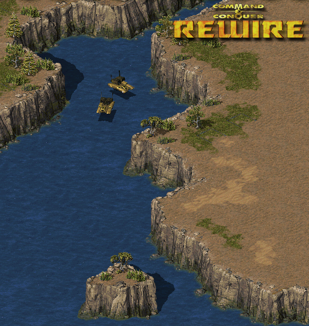
Very delayed update. Major terrain improvement. Water and Water Cliffs almost done, just few specific tiles missing(imposible water and cliff2shore tiles). Improved Tiberium veins tileset, for eye candy mostly. It cant be harvested or killed, but it will be able to damage heavy vehicles tho.
Also improved Paved Road a bit, but still far from been completly done.
Ah yes, cute cliff shadow effect is shared with public. Can be taken here. _________________ Gangster is a Project Perfect Wuj (c)Aro QUICK_EDIT
Dear god, those voxels look awful compared to when you used the original umodded voxel.vpl file. So much detail lost!
Should've simply edited the original like the guy who posted the screenshot of his test on a YR desert map. Just slightly edited to remove excess lighting.
Now there's no lighting at all and it looks awkward. Don't bother re-doing all the voxels.
Water looks nice, though. Might I suggest faking water reflections by adding cliff reflections onto the water tileset? Just a suggestion.
EDIT: Actually it was fine the way it was before:
And the alpha lighting at the front of the vehicles! That was neat, too. QUICK_EDIT
Kinda agree, this voxels is a failure. But i am still belive the perfect voxels could be done but this is kinda complex thing of good texture, normals and vpl and I am still experementing. _________________ Gangster is a Project Perfect Wuj (c)Aro QUICK_EDIT
everything looks excellent, for infantry take my TS² infantry they aren't that colourful wich looks better overall ingame, since the vanilla TS infantry is TOO colourful _________________ Hydraw Art on Facebook QUICK_EDIT
They looked much smoother and realistic before. O_o
The new ones look very pixelated.
I'm sorry, I had to draw you a diagram.
How does the one on the left not look smoother, clearer, creamier and altogether more delicious than the one on the right?
The one on the right (the one you posted) has dark smudges on an overall dull surface, you can't really make out any details. Yet on the right you've got crisp yellow remap strips on a smooth golden surface. The cockpit (or whatever it's called on a tank) is clearly visible instead of a strange black mess on the right-most, older version. QUICK_EDIT
Deary me, what kind of girls are you seeing? Anyway the updates are great but why do people think the new voxel is that great in comparison to the old one? The new one is terribly bland, the old one at least has some texture, it's no way near as messy as people seem to think, I can make out the details quite well even if it is a tad dark. Definately prefer the older one. _________________ QUICK_EDIT
Joined: 26 Apr 2003 Location: Somewhere in Germany
Posted: Sun Apr 17, 2011 10:17 am Post subject:
Orac wrote:
I'm with Morpher on this one.
A combination of the smooth normals of the new and the nice texture of the old would be best, imo.
Agreed.
With an edited VPL, it should be possible to make the textures a little brighter without screwing up the lighting. Alternatively, old voxels + increased unit light might work as well, although I can imagine you tried that already. QUICK_EDIT
Not yet. I am experementing with other thing. I have created contrast offsets for voxel's sides and special low contrast colours for top surfaces. In theory it should give nice 3d look instead flat-looking voxels but i havent go far... keep trying tho. _________________ Gangster is a Project Perfect Wuj (c)Aro QUICK_EDIT
A combination of the smooth normals of the new and the nice texture of the old would be best, imo.
Agreed.
With an edited VPL, it should be possible to make the textures a little brighter without screwing up the lighting. Alternatively, old voxels + increased unit light might work as well, although I can imagine you tried that already.
My thoughts exactly.
And look at the launchers on the new one...Messy and pixelated. The other one had smoothened launchers.
Texture on the new one is bland and the color doesn't blend well with the launchers or the cockpit. It looks awful. Looks just like voxels in the RA2 and TS map editors; bland and colorless. There's too much difference between the colors so they don't blend well at all. Now that HMLRS look as bad if not worse than the vanilla TS voxel.
Omega, the voxel is too crisp now and looks clearly like a voxel, whereas it was all smooth before and looked more like an SHP. He can always lighten up the voxel, alter the normals a bit or change the VPL so that it doesn't darken those colors as much, but still use the old voxel. That will fix the error.
I personally like the old normals. On the new one it looks like he removed BOTH the texture and the lighting, when he should've only done one of those. And the normals are way too sharp now. The launchers look like they're made of wood instead of metal now.
EDIT: Gangster said it himself, he finds that the new one is a failure. QUICK_EDIT
water-cliffs are not pretty imho...
make water transparent so it looks like cliffs are fading into it...
and maybe some mirror effect if possible
Due TMP size, there is no space for drawning any extra details you asking. There was already suggestion with raizing level of water to free up a space a bit, but this something I don't want to do. This will requre to sacrifice something about of 1/3 of it's initial height and this is a lot anyway.
Another way that comes into my mind is attaching of tile animation. My PC can handle this, but I have to worry about thouse who doesn't have good one.
This is actually good thing for brainstorming, people. I am sertanly can do an improvent here. If anyone have suggestion (or better working prototype) - speak freely. _________________ Gangster is a Project Perfect Wuj (c)Aro QUICK_EDIT
If you darken the water then I don't think it'd be so big a problem.
Even if only in a single tile's height you gave a short reflection/fade then I think it could work.
It'd be a time consuming thing, replacing all of the water cliffs, but it might look a lot better. QUICK_EDIT
Joined: 23 Apr 2010 Location: indonesia, sticking at keyboard
Posted: Mon Apr 18, 2011 10:30 am Post subject:
Reaperrr wrote:
Orac wrote:
I'm with Morpher on this one.
A combination of the smooth normals of the new and the nice texture of the old would be best, imo.
With an edited VPL, it should be possible to make the textures a little brighter without screwing up the lighting. Alternatively, old voxels + increased unit light might work as well, although I can imagine you tried that already.
Joined: 25 Sep 2006 Location: Teamblackistan Posts: Over 9000
Posted: Mon Apr 18, 2011 1:04 pm Post subject:
something should be done with the cliff/water tiles, either cliff reflections, or what would be cool would be to make the edge of the water more transparent, or both. _________________ The Fall of Hammerfest - Epic Tiberian chain story
Tiberian Odyssey mapping department. Discord The Team Black Index QUICK_EDIT
I don't think lack of reflections is an issue (how much do cliffs reflect on the ocean anyway?), it's just the cliffs look like they're floating to me. The transition needs to be a little more subtle. If you do want to do animations then waves would be awesome and likely fix any transition problems. QUICK_EDIT
you have done cliff shadow!? how you can do that it Ra2? O_O
for the water can you make it look transparent like Taktic mod ever done? i think i should be look alot better. and i really like new color MLRS just think his turret look little too dark. QUICK_EDIT
You cannot post new topics in this forum You cannot reply to topics in this forum You cannot edit your posts in this forum You cannot delete your posts in this forum You cannot vote in polls in this forum You cannot attach files in this forum You can download files in this forum