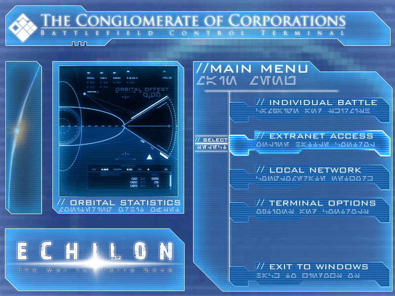
Looks very bright, although that may be a personal opinion as I'm used to the dark menu background a la C&C. I like the alienesque font. _________________ QUICK_EDIT
hmm needs more comfort, imo it's too much at once the player is facing, it needs a clearer menu, and maybe it really is too bright, try to order it properly that everyone can make out the necessary and make it more eye friendly, altough the idea is nice and it has good elements to it. _________________ Hydraw Art on Facebook QUICK_EDIT
You cannot post new topics in this forum You cannot reply to topics in this forum You cannot edit your posts in this forum You cannot delete your posts in this forum You cannot vote in polls in this forum You cannot attach files in this forum You can download files in this forum