That response of 'if you think its bad then do it better' was the same response I got from a negative comment on the Devil's Toungue.
Now... not to be rude, but, ah, doesn't THAT seem a little rude and damaging to your credibility, and the mod as a whole? I mean, if the staff is unable to handle criticism then what is the point of even posting public work and asking for responses? Sorry. I just don't get it. I won't be voting for this mod. Being an asshole to your fanbase, which if I REMEMBER RIGHT was TO's goal (make a mod appealing to the fans), is really not good either. I don't care if you guys have helicopters with rotors or god tier balance, but the rude, elitist attitude here is a huge turnoff from me playing this mod. Interest lost. Stop being so damn uppity and take criticism and people might take this mod more serious. It WAS good 2-3 years ago when it had promise, before half the team had an ego trip. _________________ Victory! QUICK_EDIT
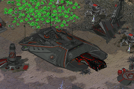
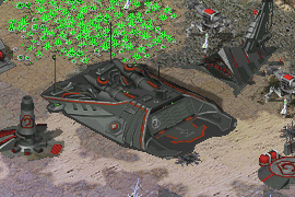
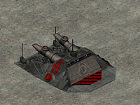
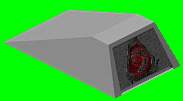
For those who think the WF too flat, look at the mockup.
I like the addition of the lights and the buildings do look washed out, the lights did add some nice contrast but I think the shadows need the contrast to make the building pop out more, because thats the only way I would consider them 'flat'.
Meh, he should just learn to accept less positive opinions regarding his work. Anyway, the building still looks too flat, even when compared to a Devil's Tongue. The vehicle can barely fit out of the building. Just a few pixels of extra height would do. _________________ QUICK_EDIT
design is not ass. but if we are talking about screen shot above i would add brightness+contrast. Plus, i would add a shadow behind to remove illusion of flatness.
warfac_797 copy.png
Description:
Filesize:
91.64 KB
Viewed:
5948 Time(s)
_________________ Gangster is a Project Perfect Wuj (c)Aro QUICK_EDIT
Design is great, though again it is percieved too flat. I'd suggest raising it a little to give more clearance to vehicles. The only other part of the SHP's design that annoys me is the back, it seems entirely flat (all of the mechanics) in the front I can tell it is 3D but low. Unfortunatly I really cannot see why the back seems is flat. QUICK_EDIT
Really good. Though i must say that i was more a fan of the previous, more round version, especially the one with audiopulse's lighting mockup.
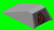
btw, the Nod logo isn't moving correct upwards with the door anim. The Door anim also looks more like it is removed by every pixel line, instead of the separate sections moving up. _________________ SHP Artist of Twisted Insurrection: Nod buildings
btw, the Nod logo isn't moving correct upwards with the door anim. The Door anim also looks more like it is removed by every pixel line, instead of the separate sections moving up.
What do you mean? It looks fine to me. _________________ QUICK_EDIT
It's kinda obvious imo, since the texture doesn't moves but each door section becomes smaller, that this was done in SHP builder (or other picture editing tool) by removing every frame a part from the lower end of the door, instead of having each door section moving.
Attached are 2 examples how such a door works and should look like.
1. Each section moves one after each other behind the next above section and finally hiding under the roof.
2. The whole front moves with each section being linked together and moving as a whole under the roof.
Notice how in both version the texture moves, which it does not in the TO warfactory dooranim, thus giving it a strange non-realistic look.
You cannot post new topics in this forum You cannot reply to topics in this forum You cannot edit your posts in this forum You cannot delete your posts in this forum You cannot vote in polls in this forum You cannot attach files in this forum You can download files in this forum